Oh you have no idea. When we moved into our house five years ago, I didn't love the bathroom. The paint job was ugly, the floor was ugly, all of the fixtures were cheap and...well...ugly. But, then, when we lived with the bathroom I began to hate it. We found that the previous homeowners had done things like hide water damage on the floor under a basket. Looking more closely at the grout in the tile, it looked like they had painted it white, to cover mildew. Mildew that grew no matter what we did to combat it. Five years we lived with it while my displeasure grew and grew. And then there was the leak. The ceiling in our kitchen began to drip. So guess what that meant! Time for a new bathroom! Finally!
Picture heavy post follows. Hope that's okay. This was a total redo. We tore out everything. And with the help of our talented and knowledgeable and generous friend, Jeff, we made my dream a reality.
 |
| Before |
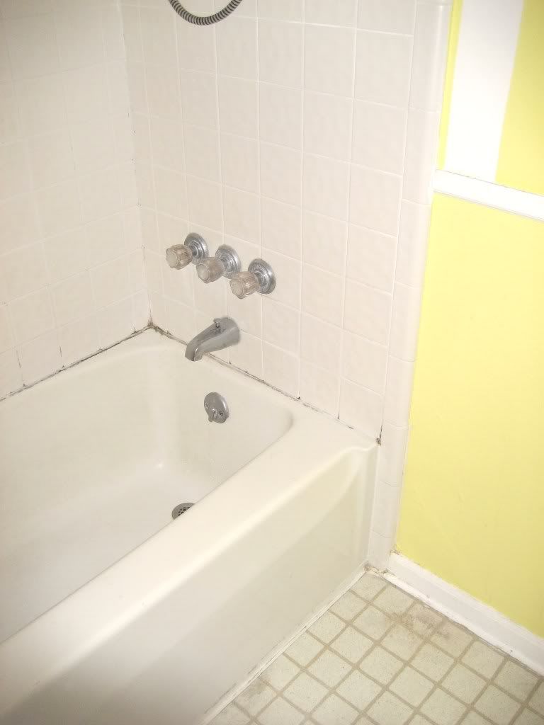
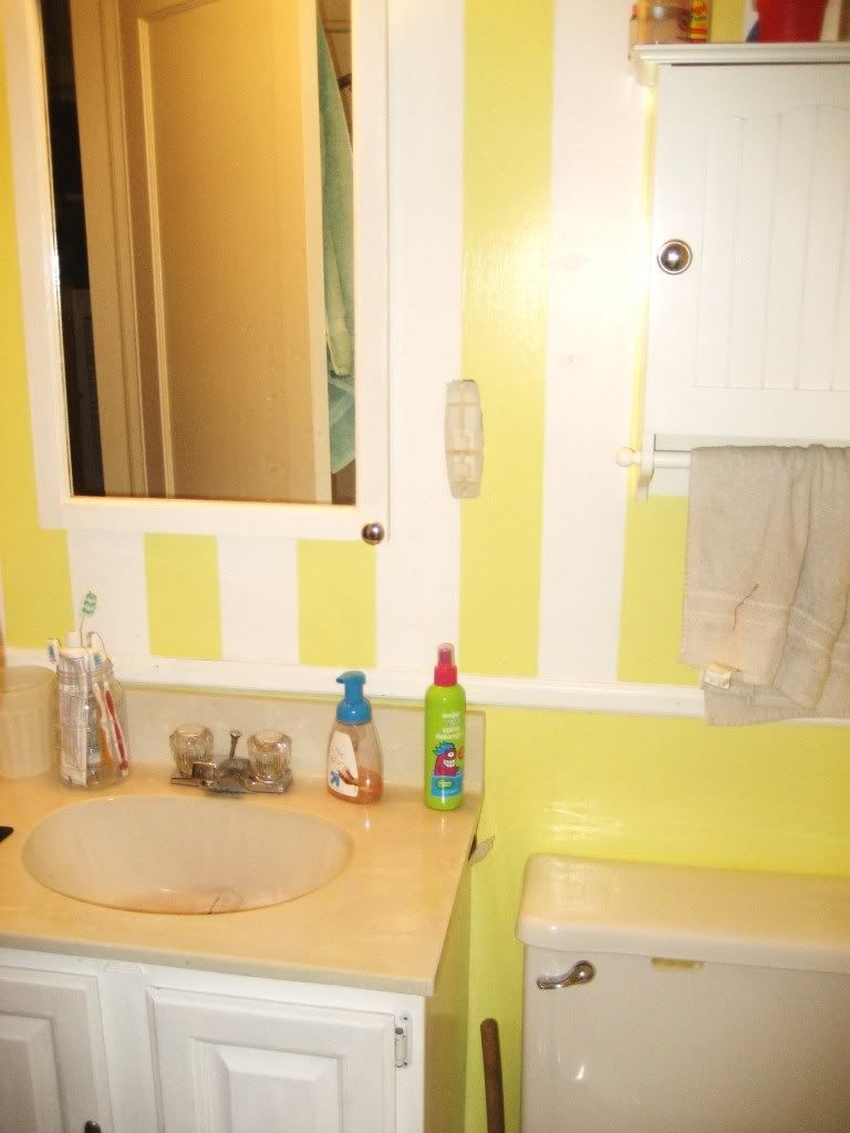
The hideous and awful before. Please, bear in mind, I had no say in any of these before choices. The color, light fixture, medicine cabinet, everything was here when we moved it, and I felt that things like our neon green, purple and gray kitchen (I kid you not) needed attention first. And, I know it's messy. But, knowing that we were going to rip everything out for a week or so sort of put a damper on my desire to clean it. That's just the truth.
The mildew is so embarrassing, but I swear, there was no conquering it. I re-caulked that tub over and over. I paid to have someone do it. We had automatic tub cleaning spray. It was coming from behind the walls. Plus, the fan wasn't venting out side. Helpful. And you can see in this pic the water damage on the floor that the previous owners had hidden underneath a basket. Lovely.
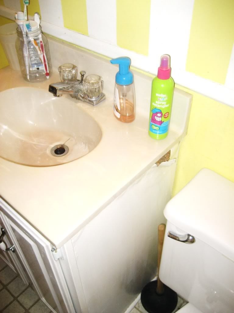
Where to even begin with what I hated here. The sink basin was cracked. They had a plastic cup holder permanently attached to the wall. The bottom of the line faucet with the clear and ope nasty handles that get gunky and dirty and you can see that, so you have to unscrew them to clean them every time. The toilet with the odd gummy sticker that I couldn't remove for anything. Uggghhhh. Remembering just how bad it was.
And here as you can see, the cabinet itself was falling apart. Particle board sawdust got all over anything you put into the cabinet. It wasn't level, so water would track down that side of the cabinet.
When they tore everything out, they found that there was NOTHING between the tile and the outer wall of the house. SO there was mildew and water damage on the outer walls. Also, the pipe going to the drain was bent up and over a beam, so water couldn't drain and it would pool. Hence our giant leak. :-/
 |
| source |
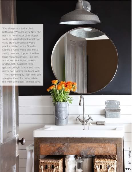
A little while ago, I fell in love with this bathroom. I wanted to make this my new reality. I already had dark gray paint that I had won from Dutch boy and used in the dining room. That's a start! So I said, let's go for it!
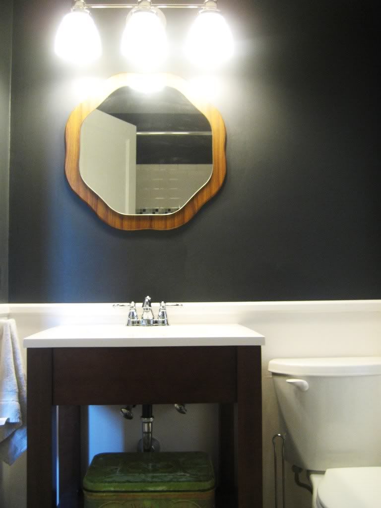
So, here is our rendition of it:
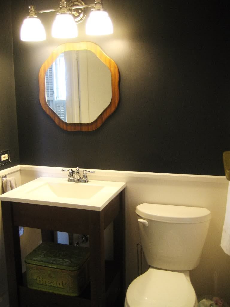
What do you think? I am so excited about it! It's my new favorite room in the house. The kids have been getting extra long bath times.
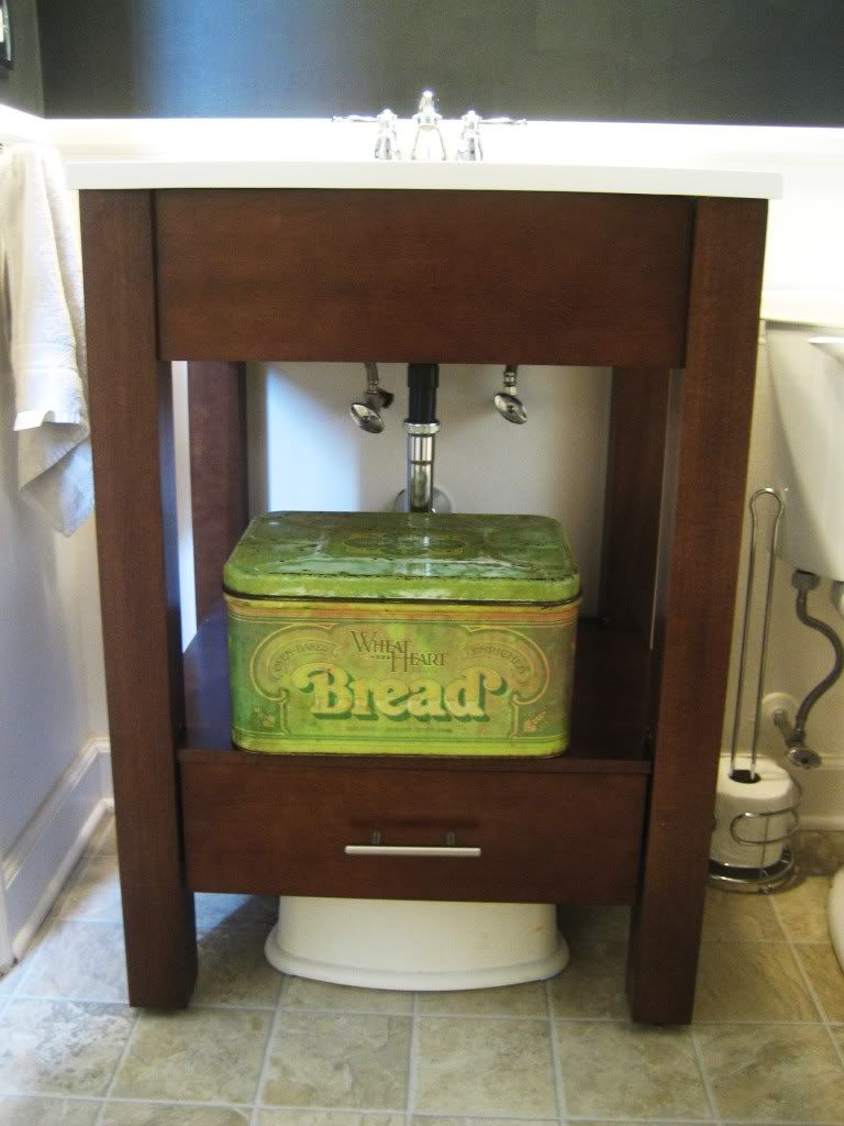
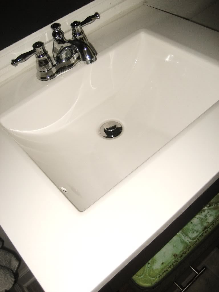
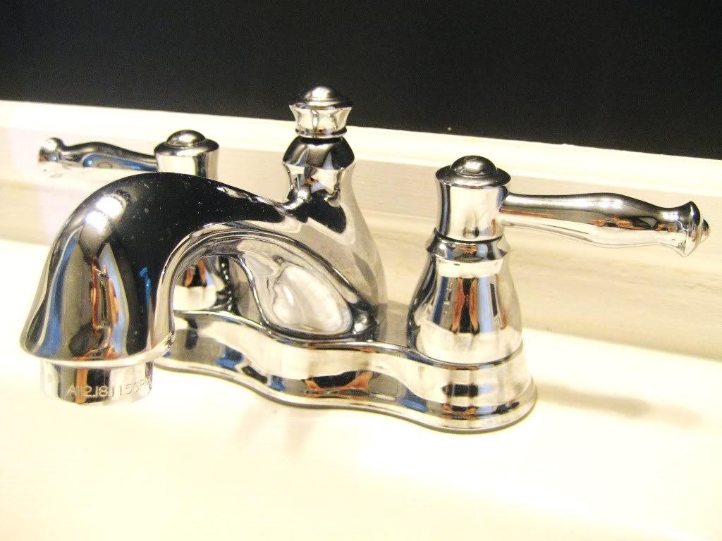
I LOVE the sink. It matched my inspiration picture almost perfectly. And I love that it's open, that it has room enough to still put a soap dispenser and toothbrush holder. I love that you can see the floor under it. The door barely clears it, but it does. And since it's open it doesn't visually look like it takes up a ton of space. Also, it's unique, and sturdy and only $199 at Home Depot. I couldn't believe it. Just thanked God for his provision and bought it.
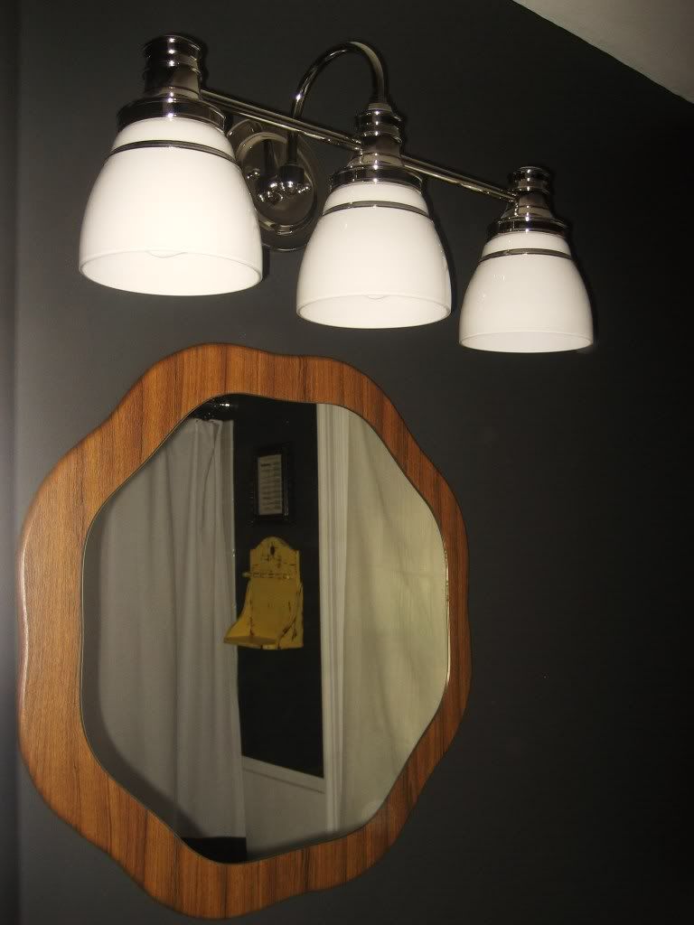
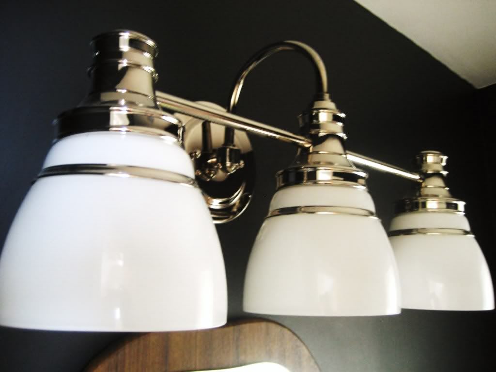
The mirror I bought at one of our favorite antiques stores. It's round like the inspiration pic, but unique. And I lately love wood and gray together. The light fixture is a Martha Stewart item. Since half the wall was so dark I chose shiny and bright, reflective surfaces whenever I could.
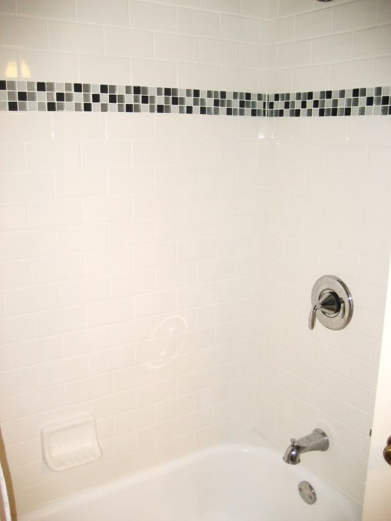
And now the shower!
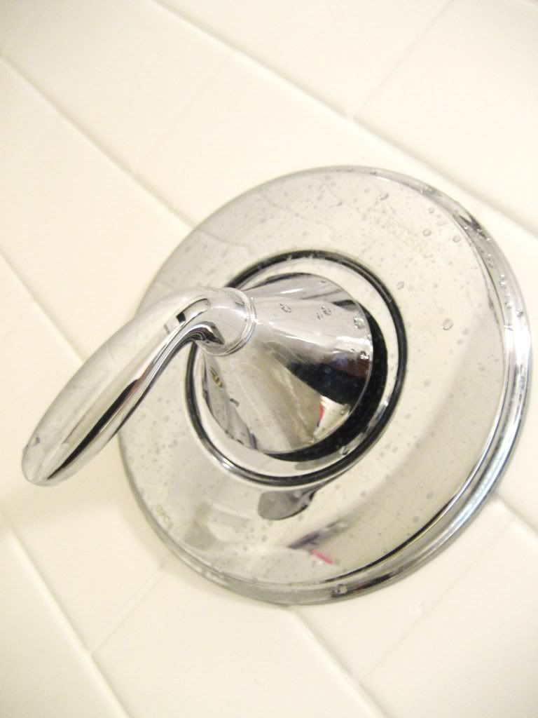
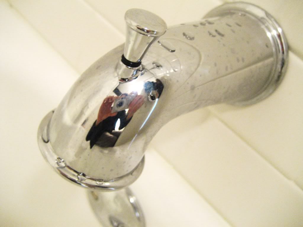
Isn't it pretty?!? I love the subway tile. I also love that it was $4/sq ft cheaper than the tumbled stone tiles. I love that it's bright and white and clean and mildew free! I love knowing that there is nothing behind those shiny tiles that I need to worry about.
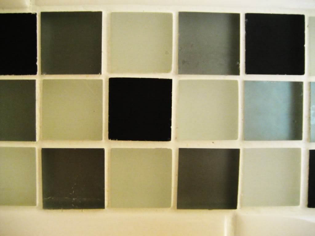
The tile Justin fell for and didn't want to look at anything else after he saw it. It's a nice compromise between the modern glass mosaic tiles I was looking at and the more retro black and white check that Justin likes so much.
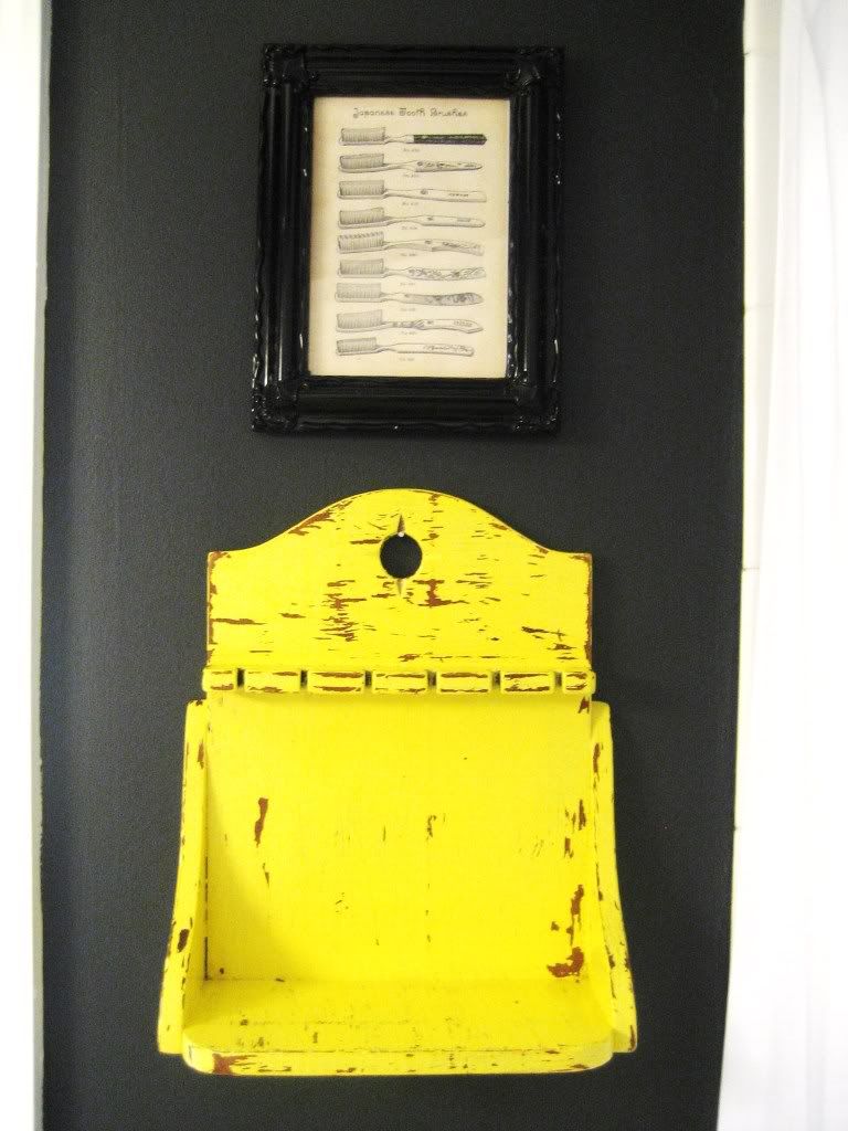
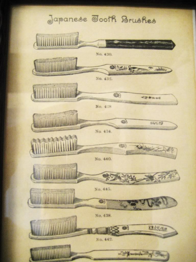
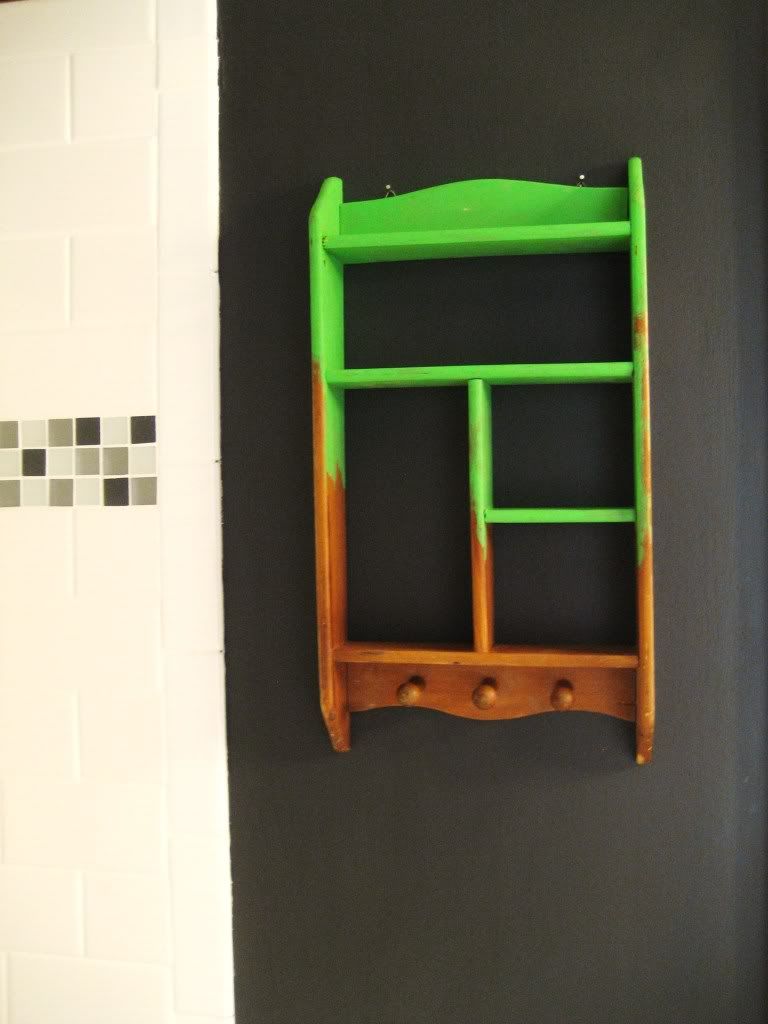
I ordered two vintage shelves from the Junkman on Etsy. I love this yellow one. And above it I printed and framed a Japanese toothbrush image from The Graphics Fairy.
The other one I had left it up on the computer, and when I came down in the morning Justin had printed it out and written "Buy this!" on the paper. So I complied.
And finally, the floor. We bought this remnant years ago for $15. I am so happy with how it works in here. There is both gray and brown in it. It warms up the room. Oh, and it isn't dingy or water stained. Happiness!
We're still waiting on a custom shelf unit for above the toilet. And we need need a few decorative odds and ends. But, I just couldn't wait to share any longer.
So there it is! Five years waiting for it. So worth the wait. Now I am exhausted. Perhaps I will go take a bath. :-)

9 comments:
Way to go lady! LOVE the shower!
It looks great...love that sink and the tile!
That mirror with the wood plaque COMPLETES your bathroom perfectly. Fantastic before and after, job well done.
I'd love to see more
-Irwin Zinkin
Custom Mirrors Suffolk County
Good job on the renovations! I can see that you have incredible taste when it comes to design and colors. Looking at the previous photos, you’ve gone a long way with the improvements. It looks more sophisticated and elegant now! It is marvelous. I didn’t even see any remnants of the past bathroom. The mirror and the lighting fixture definitely give the space an interesting look.
Max Boughner
Definitely worth the wait! The improvement of your bathroom is splendid. I’m glad you finally got rid of the old, yellow walls and your awfully cracked sink. I see you changed every single detail of your bathroom and you managed to turn your inspiration into reality. Your bathroom looks gorgeous and definitely way better than its previous look. Well done!
Kristopher Diss
My favorite fixture in your bathroom is the mirror with lights above. Don’t get me wrong, I’m not vain! Keep it as simple as it is, and don’t add more wall decors. Maybe, if you want to make it airy and spacey, you can consider adding some windows. Anyway, overall, your bathroom renovation was a success! Cheers!
-Carmella Vancil
Oh wow! I love how everything turned out. We are planning a bathroom redo for this winter. It's kind of tricky because it's our only bathroom, but we'll somehow manage. I laughed when I saw your tile because that's exactly what we're going for. We may be doing the small squares in the black/white combo though. My husband was fond of them, and I really don't care as long as it gets done. Thanks for sharing. I am pinning this for inspiration.
Looks great! What a night and day difference. Wow. I love the new look. Thanks for sharing this with me!
Cheri
I’m here with you, Susan. The yellow paint looks good, but it is a little too bright for the bathroom. It is good that you opted for a bold and darker color. Not only does it make the bathroom look elegant, it also gives that intimate and warm feeling, compared to the previous one. And the bathroom fixtures add some much needed sophistication in the space. It even looks like a bathroom in an upscale apartment! Very simple with a touch of class.
[Lilia Ogata]
Post a Comment